Simplicity Burger
Renowned chef Neil Rankin asked us to brand and style his latest restaurant concept.
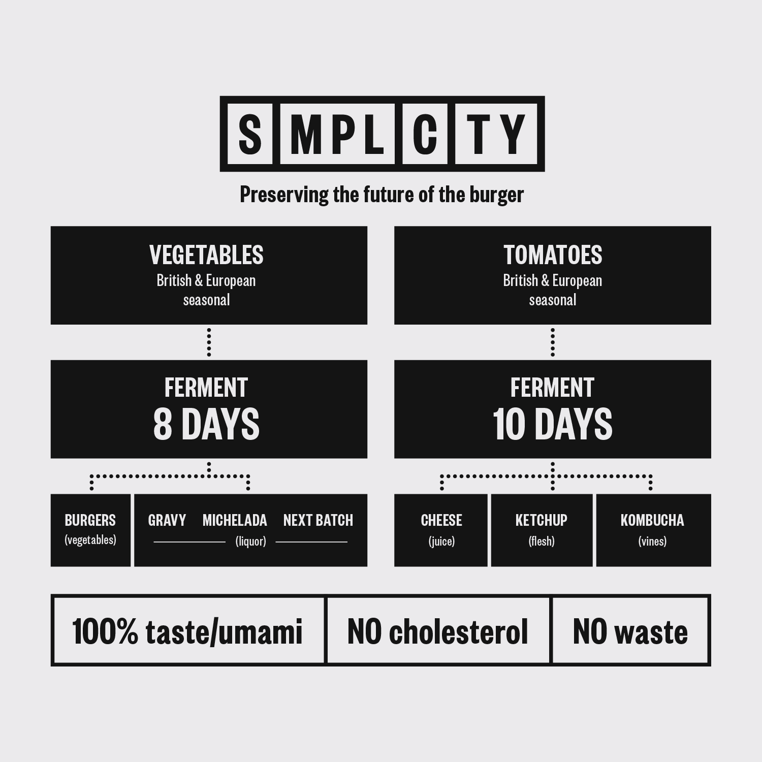
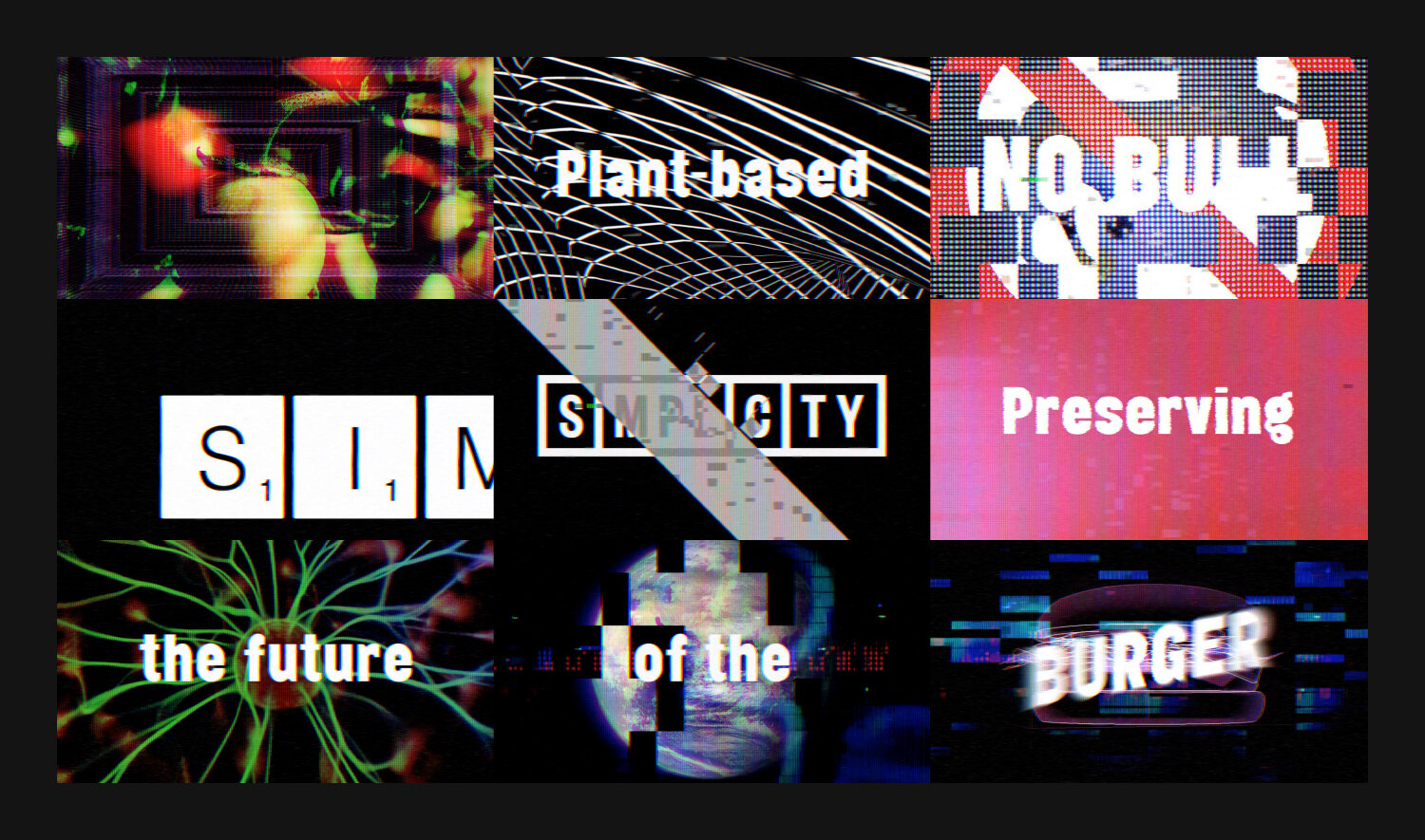
Simplicity is the culmination of months of research and experimentation by Neil into creating a meat-substitute burger using fermented vegetables. His aim was for a process that ensured zero waste and a product healthier and more sustainable than the meat equivalent while closely matching it for taste and texture. We created an infographic to simply explain the process.
COPYWRITING / DIGITAL / IDENTITY / PHOTOGRAPHY / illustration / INTERIOR / print / food and drink
Branding
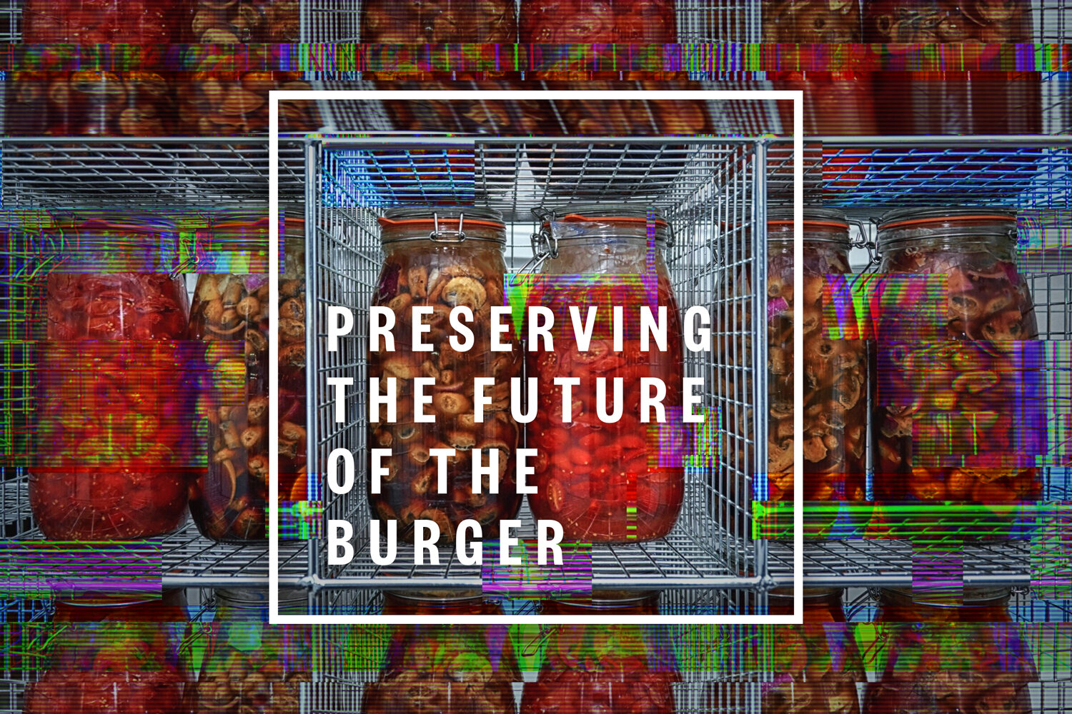
We avoided anything organic and plant-like in the Simplicity logo, instead keeping it clinical – with a nod to the periodic table of elements in reference to the natural chemistry involved. We generated the descriptor ‘Preserving the future of the burger’.
“Mascot have been incredible. The journey has been a masterclass in creative thinking. It’s rare to find a design company who can take your vision and make it their own.”
— Neil Rankin, Owner and Chef
Restaurant styling
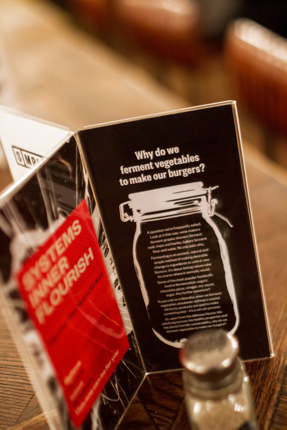
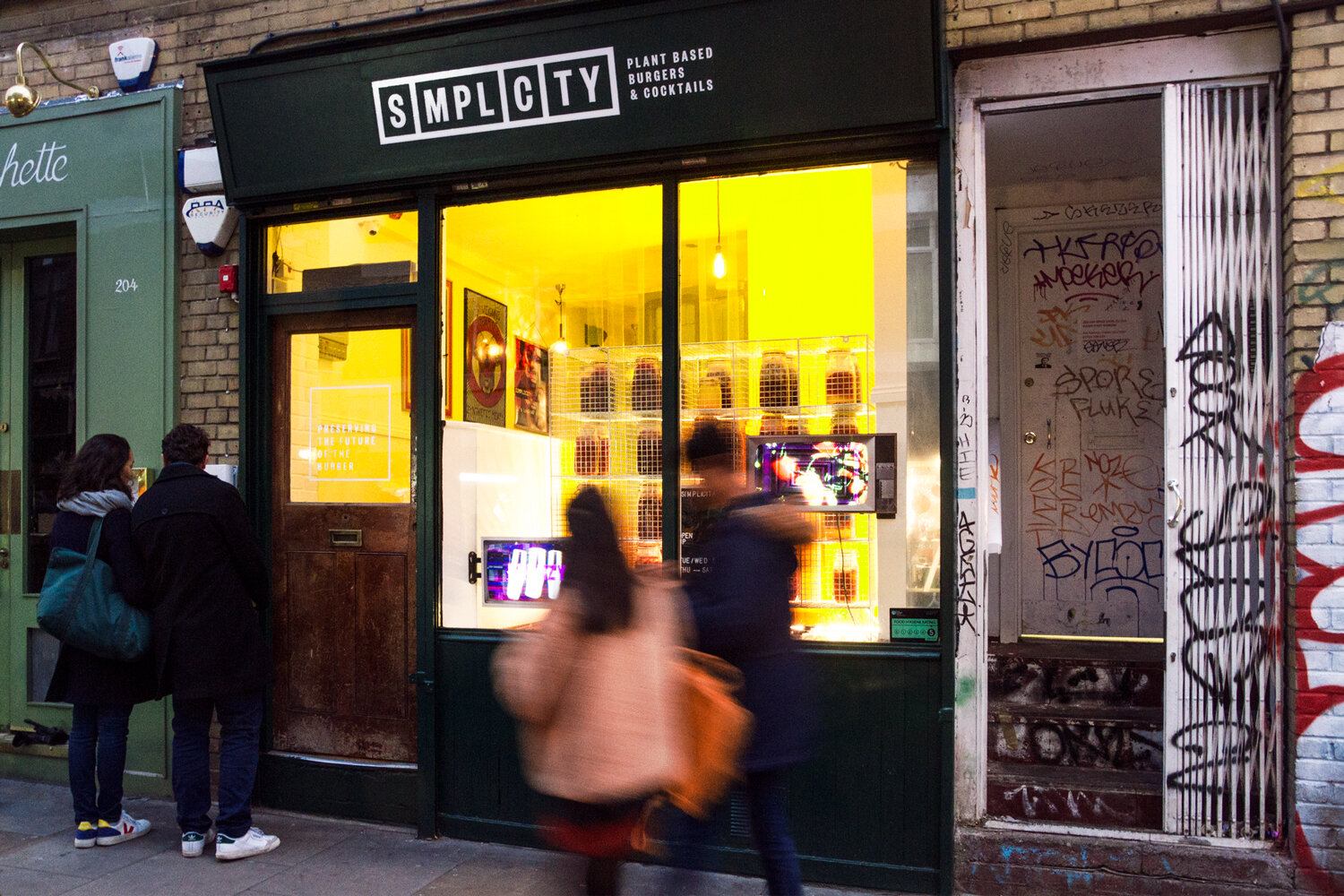
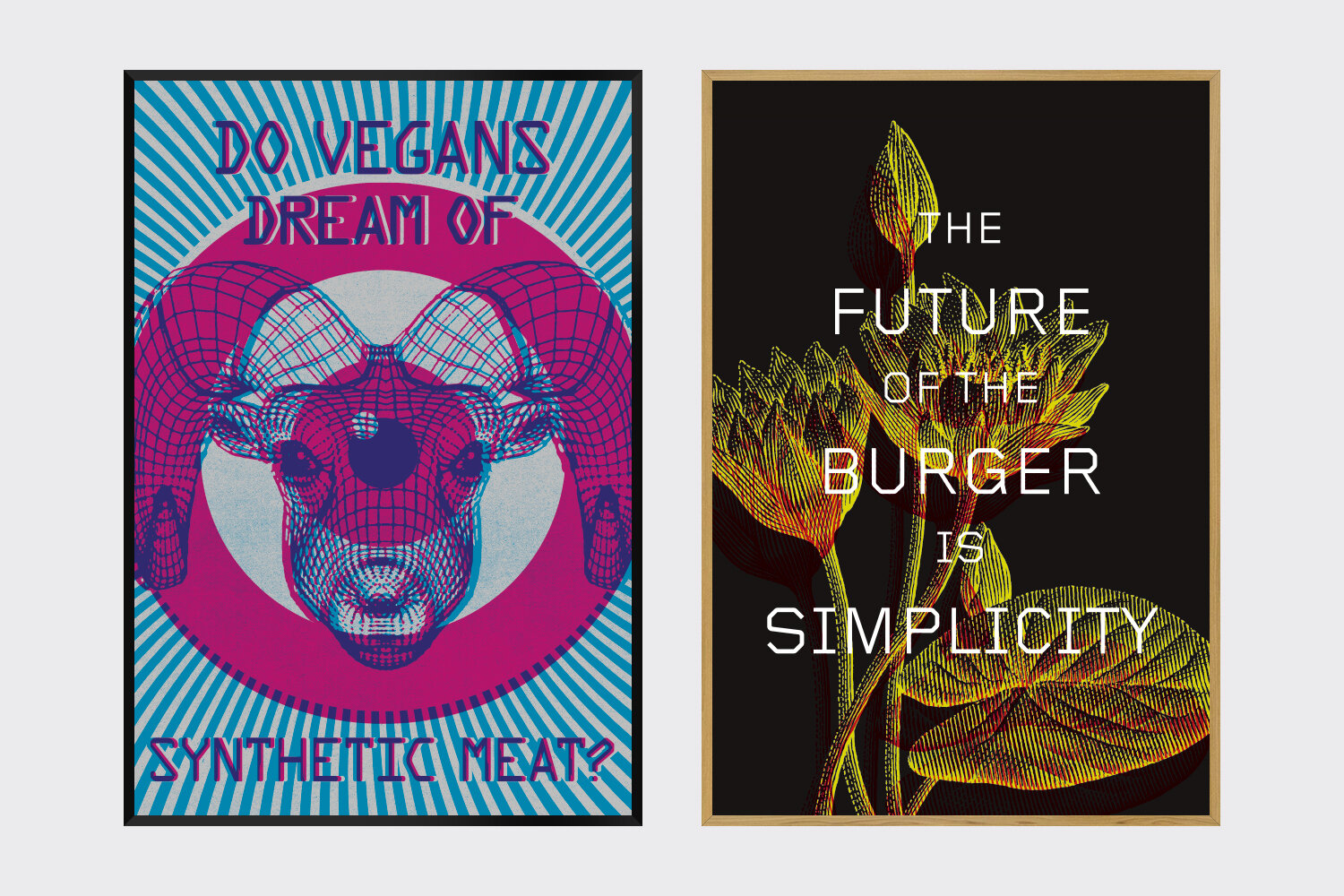
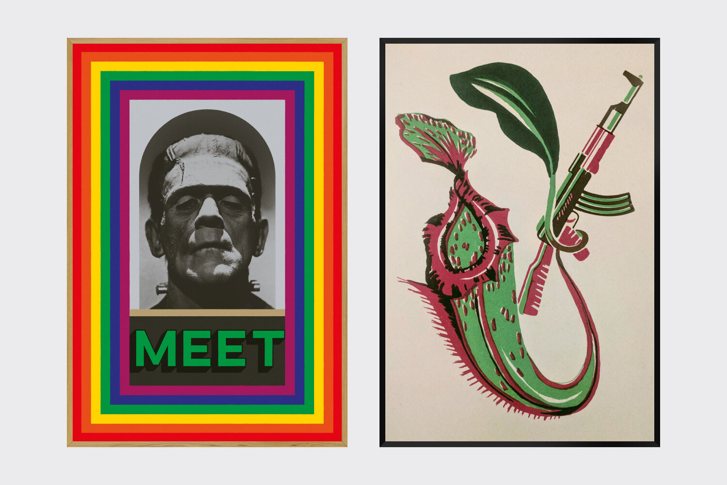
The concept of making ‘meat’ from plants gave rise to our creative theme for the restaurant of skewed science fiction. Rather than being hidden from sight, large mason jars full of fermenting ingredients are stacked in cages in the window. This display proudly demonstrates the key preparation process in a retro science lab-like art installation – an impression emphasised by two video screens illustrating, with deliberately scratchy interference and jumpy editing, the principle of Simplicity. To decorate the interiors of the restaurant we conceived and produced a collection of framed artworks depicting ‘weird science’.
Cocktail bar
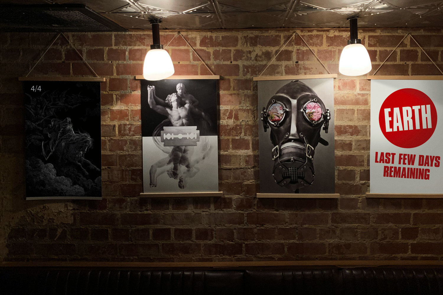
Simplicity has a cocktail bar in its lower floor – ‘Last Days on Earth’. We rebranded this with a suitably distressed, gritty logo to echo the idea of a dystopian future. Framed posters of apocalyptic images, with a few relieving elements of lighthearted humour, were specially created to adorn the walls.

