The Sauce
Burger restaurants are ten a penny. So, from the outset, The Sauce wanted to be different. It wanted to be the maverick that stood out from the pack rather than running with it. It wanted to revolutionise burgers by surprising with the unusual: venison, soft shell crab, king prawn. The enhancing heroes are the classic global sauces that give the concept its name.
The Sauce’s first restaurant opened in Highbury in 2019 and quickly became a local hotspot. Keen to jump on and grow this success, the founders approached us to create a new identity, visual style and brand personality.
COPYWRITING / digital / identity / illustration / INTERIOR / PACKAGING / PHOTOGRAPHY / print / food and drink
Logo
The jaunty style of the logo we created captures the cheeky nature of the brand. The unique hand drawn lettering could have been squirted from a bottle while the splash of sauce doubles as a slurping tongue. The ‘Burgers are Risen’ motto indicates that The Sauce has elevated burgers to new heights.
Restaurants
The attributes of sauce (as in relish) lend themselves to graphics that can literally drip, drizzle and drown. The alternative meaning of sauce gave us great scope to generate fruity graphics and cheeky copy lines that characterise the brand’s mischievous, street-wise personality. These are all applied in various ways to different elements of the restaurants: pre-opening hoardings; shopfront decoration; wall art.
Menu
Clarity and ease of use are key to any menu, so we deliberately kept this bold and unfussy. Coloured panels and an obvious hierarchy make it easy to navigate. It’s been stripped down to the essentials with no superfluous copy or graphics to distract attention from the all-important descriptions. The cheeky element is relegated to the cover.
Interiors
To enhance the restaurant styling we created a range of colourful graphic panels that collectively demonstrate the brand personality. These include, for example, intriguing visual metaphors for each of the sauce flavours. All are bright and eye-catching and add a fun element to the interior decoration. We also generated an animated video loop to show products and marketing messages in an inventive way.
Packaging
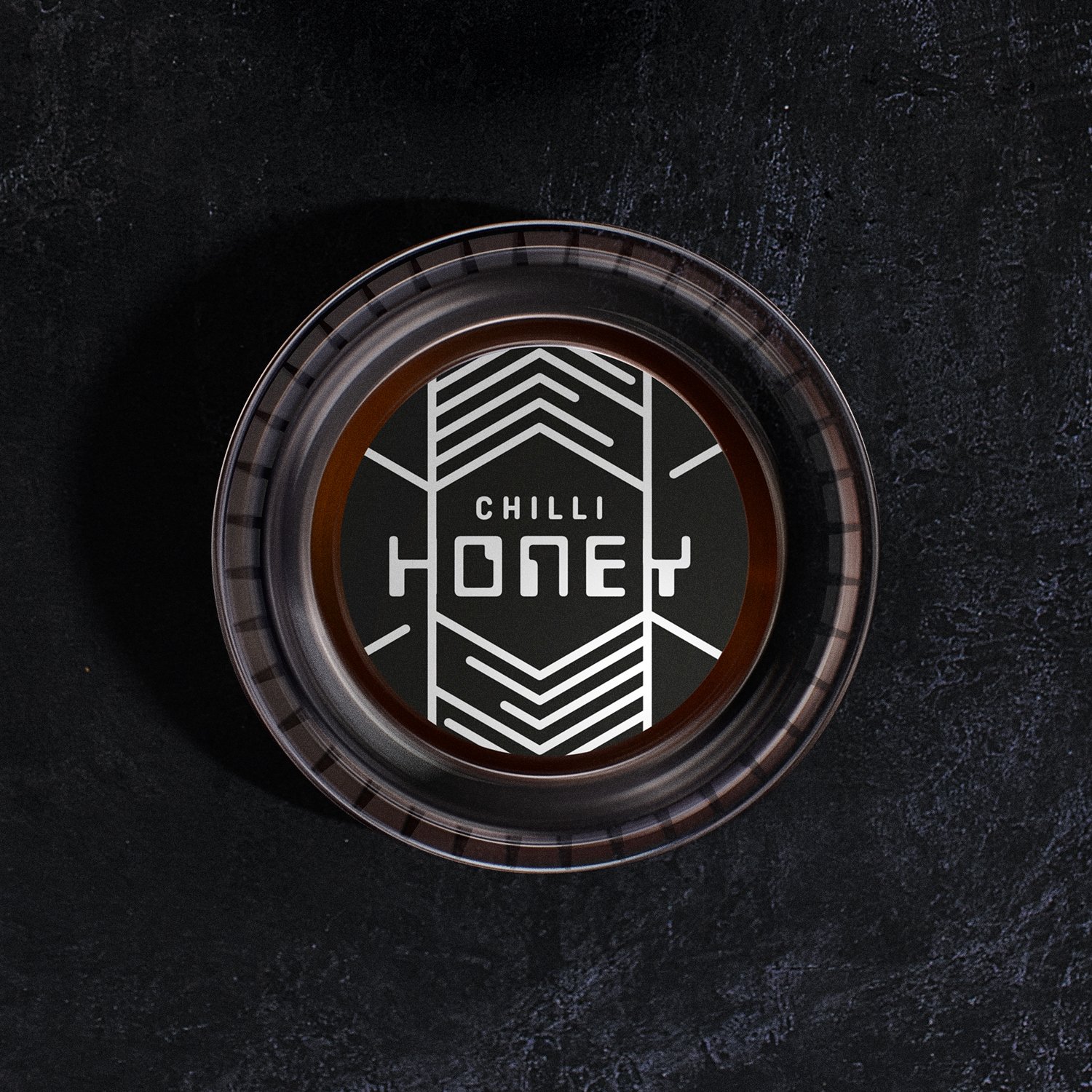
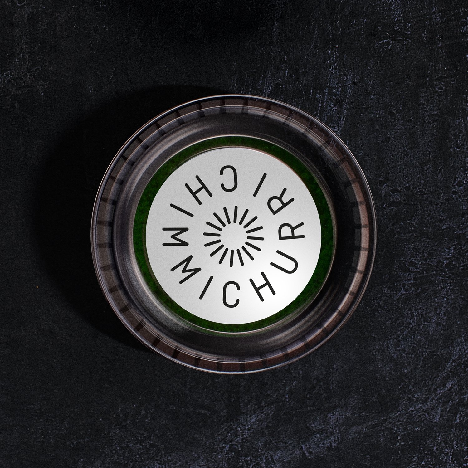
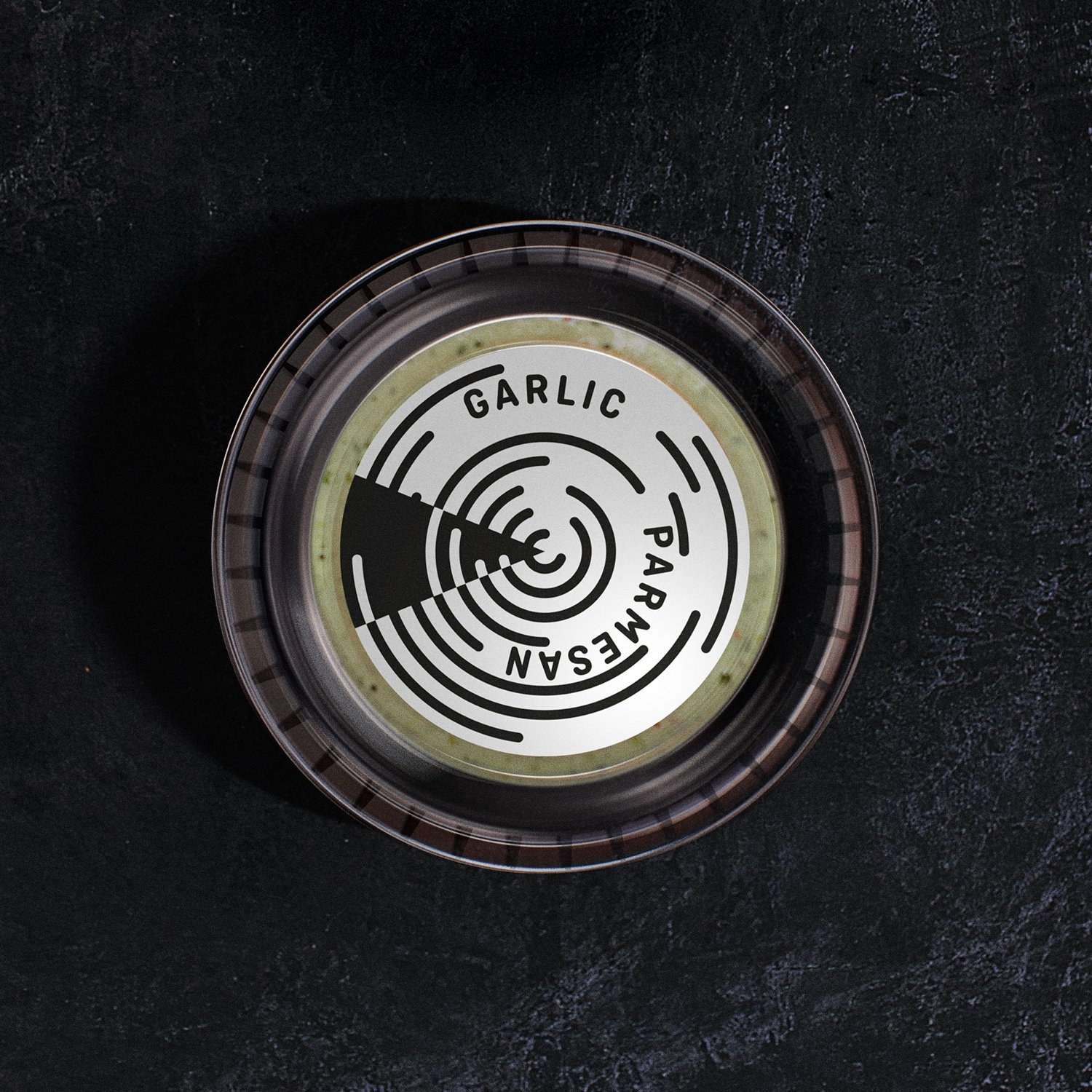
We designed a selection of eco-friendly take-away boxes that can be customised with stickers. These are complemented by sauce-proof wrapping paper. Individual sauces are available in bottles with distinctive labelling relevant to the culture of its country of origin.
Marketing material
It‘s important that The Sauce presents a consistent customer-facing image that keeps the brand familiar and recognisable. We’re responsible for producing a distinctive range of promotional material such as flyers and A-boards as well as social media content and animations.
Uniform
Simple, subtle and street. Staff t-shirts and hats are cool and understated with discrete branding. Who wouldn’t be happy being a ‘Saucerer’?
Website
An attention-grabbing site that’s both informative and entertaining. Our website design reinforces the brand style with its striking black and orange livery and appealing imagery. The food looks great and we‘re proud to show it in all its gloopy glory.
Photography / Manifesto / Landlord pack
To promote The sauce to Landlords and Franchisees we produced a manifesto document to explain the concept and demonstrate its exciting business potential. We art directed and shot the photography to capture the character of the brand and its founders. We deliberately portrayed the partners in a natural and informal way to reflect the fun nature of the brand.


