Eighty Eights
Winchester’s top take-away restaurant and grill asked us for a complete re-brand. Specialising in gourmet burgers, pizzas and kebabs and without a specific name, the business had become known as ‘since 1988’ – the year it was founded. We recommended ‘Eighty Eights’ as a punchier alternative to the adopted name.
COPYWRITING / identity / illustration / PACKAGING / print / food and drink
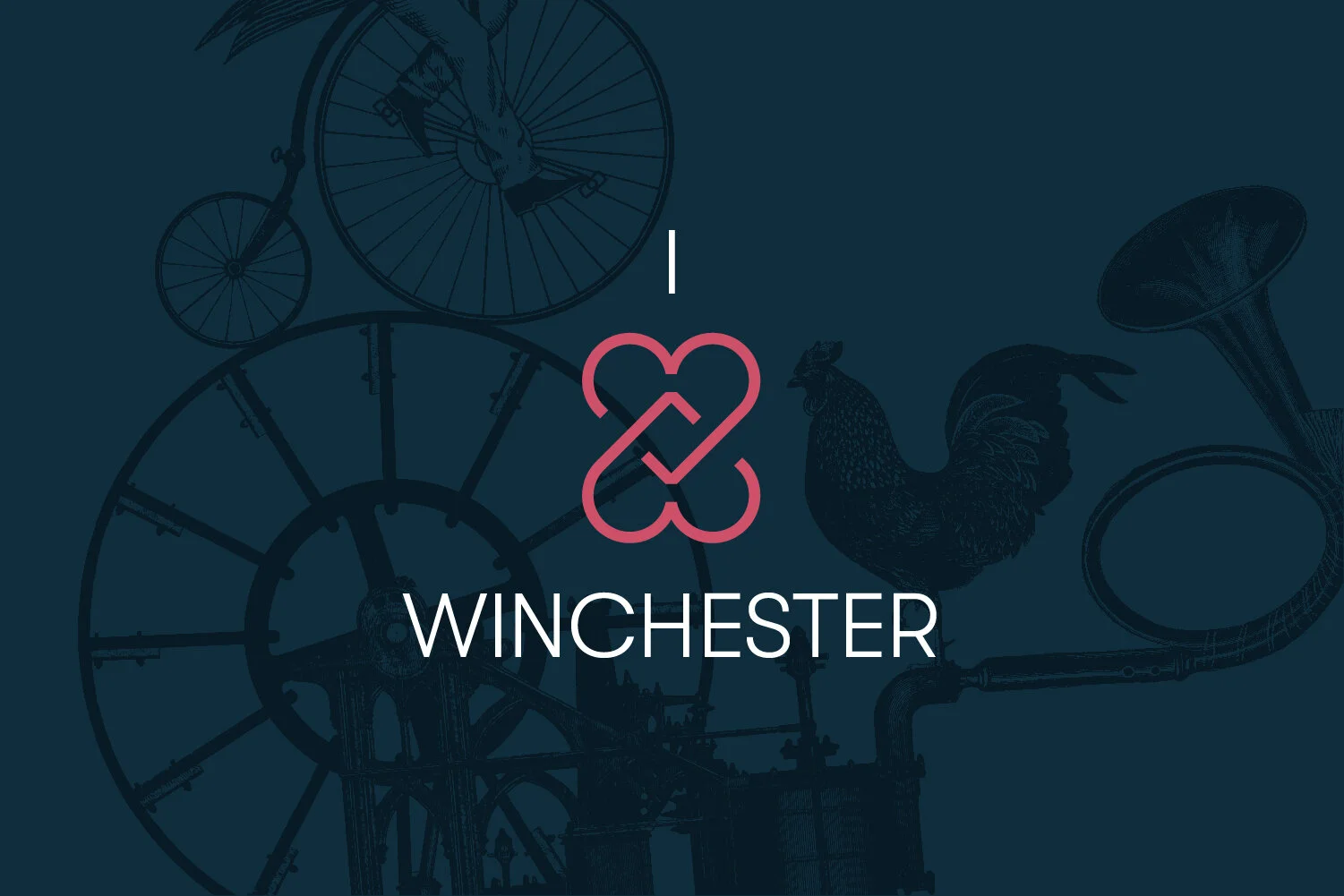
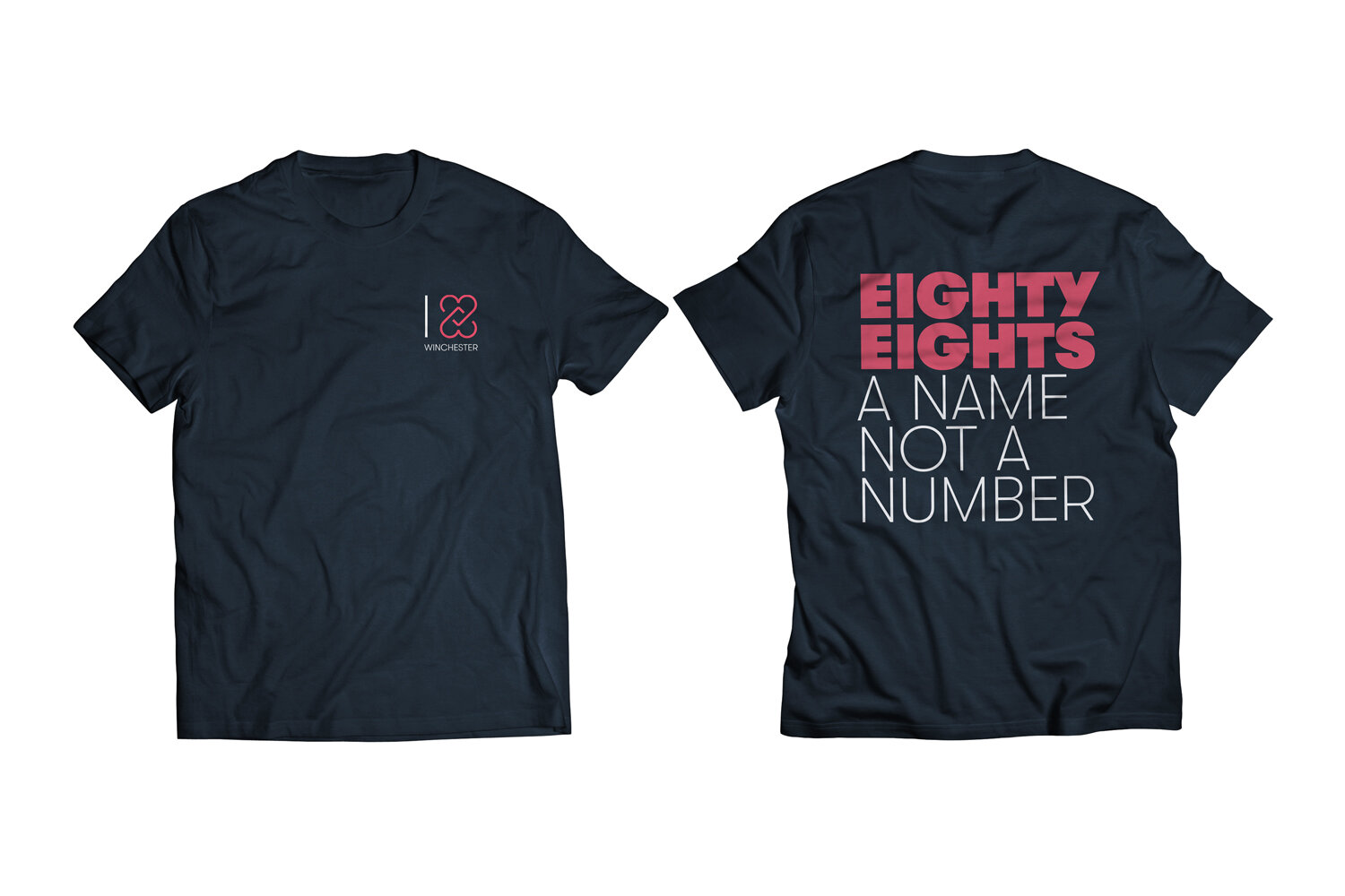
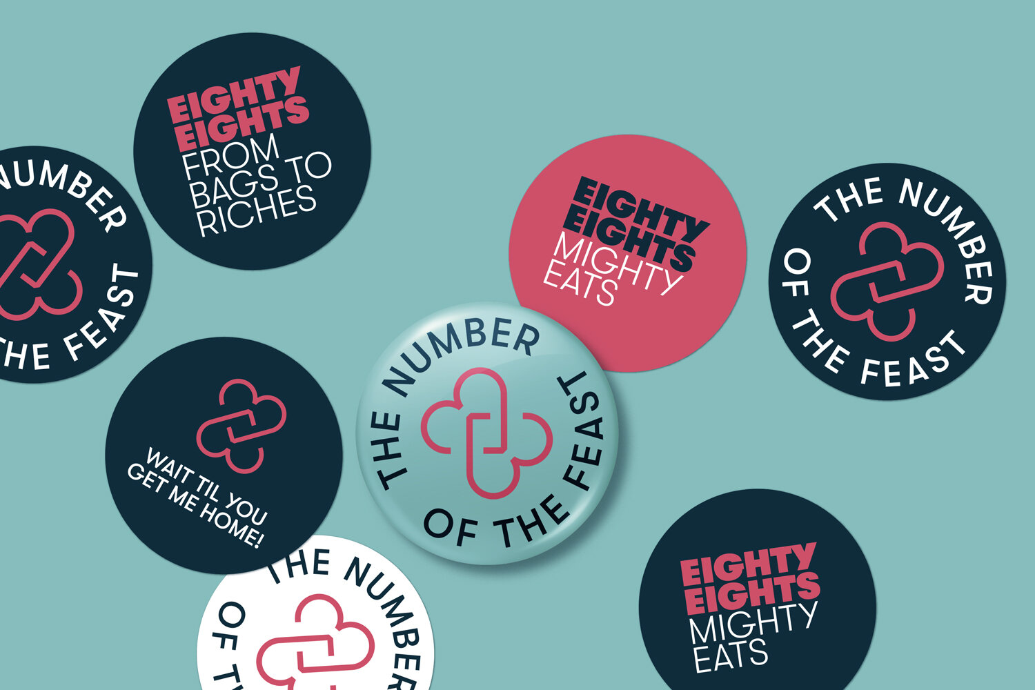
We designed a brand identity comprising a bold namestyle and an ‘88’ symbol formed by two entwined hearts. These core elements can be combined in a variety of ways or used individually to provide consistent yet extensive brand application. We were pleased that the client was adventurous enough to run with our colour palette which breaks the conventions for this type of outlet and gives standout from the competition. The magenta, aqua blue, corn yellow and prussian blue are used in various permutations on everything from the shopfront to staff T-shirts.
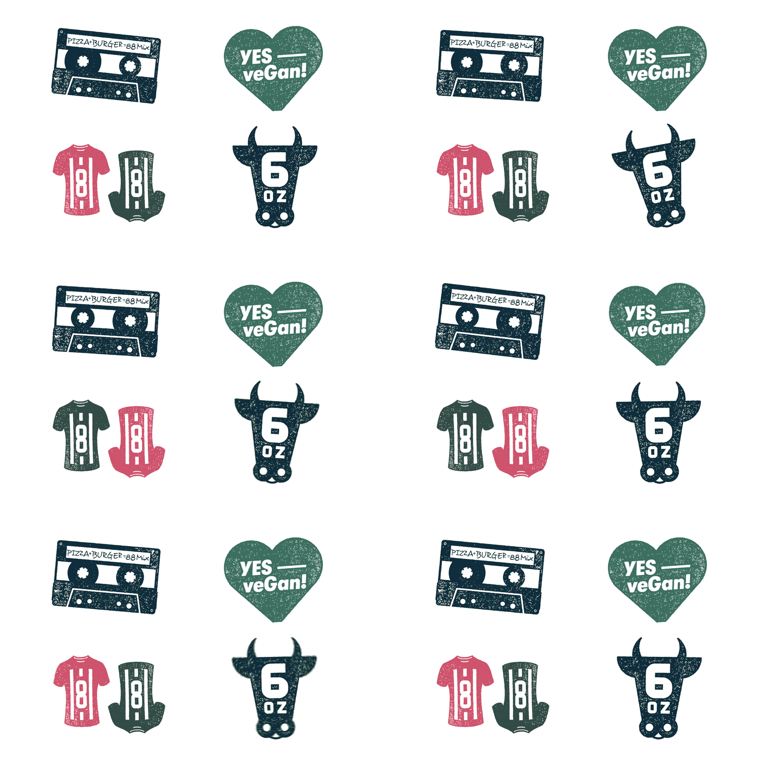
To provide visual relief in the extensive menu, we designed a range of relevant ‘88’ icons and produced a Victorian illustration collage for the cover – another daring departure from the expected.
Copy-wise we wrote a selection of lines aptly relating to numbers or to food. These add personality and enliven packaging, stickers and T-shirts.


