Found
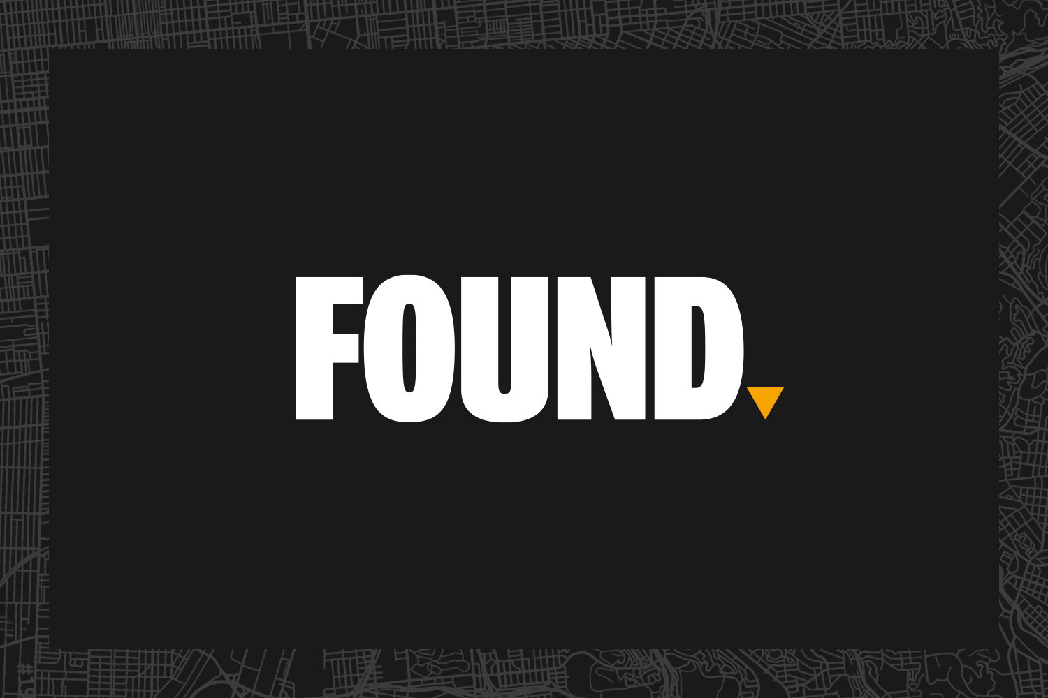
Found, a boutique property consultancy specialising in the restaurant and leisure sector, asked us to design and apply a brand identity. To suit the confident assertion of the company name, we created a bold, no-frills logo that means business.
The logo comprises strong upper-case typography coupled with a triangular ‘full stop’ that turns the name into a self-assured statement. It unequivocably suggests “Engage us and this is the result.”
COPYWRITING / DIGITAL / identity / PHOTOGRAPHY / print / food and drink
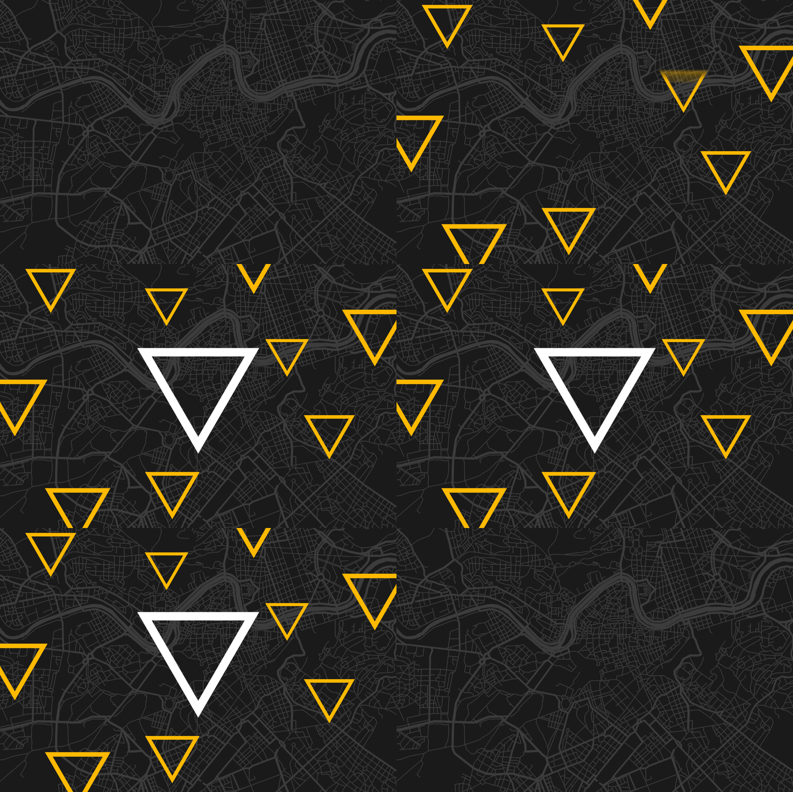
The triangle is a versatile graphic used in different formats with various relevant references: pinpointing, direction, surveyors’s triangulation. It is applied in conjunction with simplified map graphics and aerial photography.
Found prides itself in providing ‘Creative Property Solutions’ so our concept for the website was based on quotations from genius artists and inventors who’d found different and better ways of doing things. This theme leant itself to using imagery not normally associated with property companies. The unusual and distinctive look is intriguing but also infers that Found too is different and has a better way of doing things.
“Mascot immediately got us. We knew we had a great name to play with but Mascot really did a number on it. The style and theme they came up with are extra layers of gloss that give us an edge on our competition.”
— Nick Garston, Managing Director


