Osteopathic Centre for Children
We were asked to rebrand the Osteopathic Centre for Children to help mark its 25th anniversary year. The OCC is the clinical wing of the Foundation for Paediatric Osteopathy and provides osteopathic treatment to babies and children.
Inspired by osteopathy’s natural energy, its spiritual qualities and its use of touch, we designed a symbol in the style of a primal mark depicting two figures hand-in-hand within an organic shape. The simplified, primitive nature of the symbol gives it relevant childlike attributes.
identity / illustration / interior / print / photography / charity
“Mascot worked with enthusiasm, imagination and energy.
They understood our ethos, so designed accordingly and took very honest photographs of our treatments. We’re extremely happy with the strong, authoritative logo design and the way Mascot applied a consistent style to literature and the interior of our Centre. We certainly hope to continue our collaboration with Mascot.”
— Patricia Ferrall (Chief Executive)
One objective of the brief was to unite the OCC and the FPO in one logo. Rather than using the same typeface for both, we hand drew the type for the OCC to reinforce its child-friendly aspect while using a regular font to reflect the more formal, educational nature of the Foundation. This way, while unified, distinctive characteristics of each were retained.
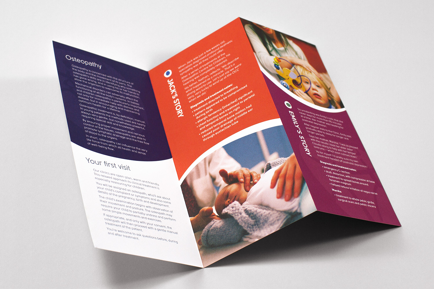
To illustrate the organisations’ fund-raising brochure and information leaflet, we took emotionally appealing photographs that capture, in a very real way, both the sensitivity of the Centre’s treatments and its informal warmth. The images are framed in amorphous, cell-like shapes that subtly allude to the very life force from which health can be rebalanced by osteopathy.
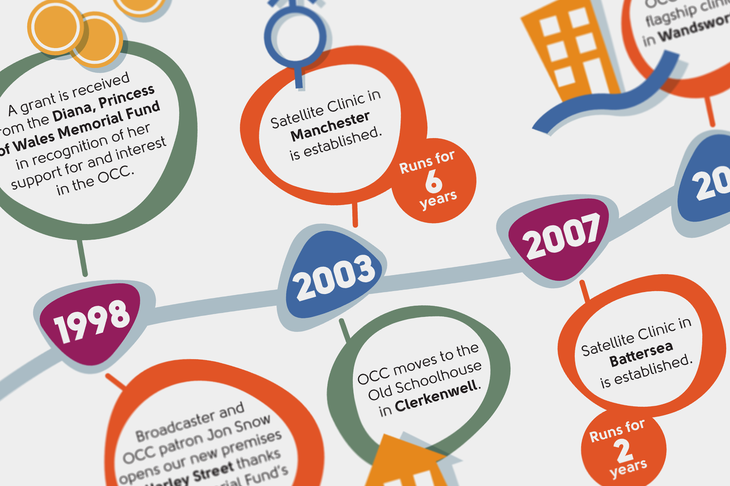
We applied similar organic shapes to the design of stationery, signage, infographics and to a logo for the organisations’ Sweetpea Appeal.


